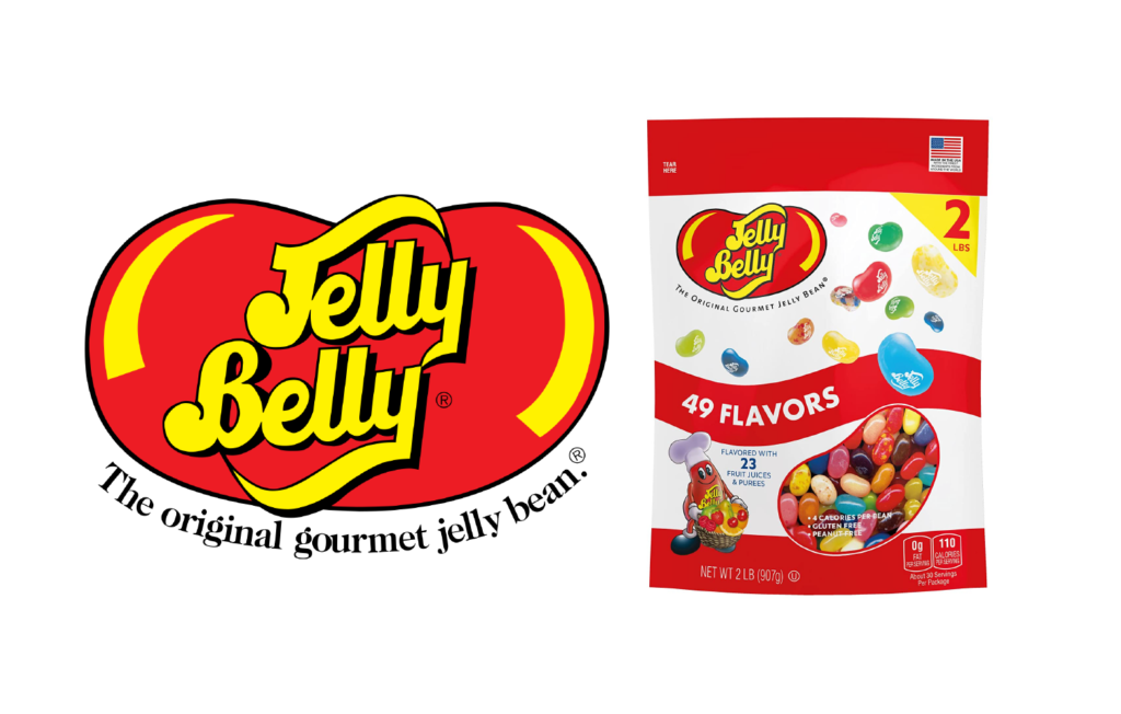
Jelly Belly Candy Company is a step into nostalgia and happier times. Candy sales began in a little shop in Belleville, Illinois and through the passing of traditions, ingredients, and dreams, the company grew on and in 1976 the name Jelly Belly Candy Company was coined and it quickly became the company we grew up loving. The company creates various candies and confectioneries that are sold to sweet tooths all over the globe.
Solution
The company has not kept up with the rapidly-changing world of technology and social media. In order to grab the attention of a younger, and current target audience, there should be a push to dive into the minds of those 16-25-year-olds by considering an overall brand redesign, simplifying brand attributes to interest this age group, and considering what ways this new target audience will interact with the products. All of this should be considered and kept within the overall friendly and traditional tone that Jelly Belly has already established.
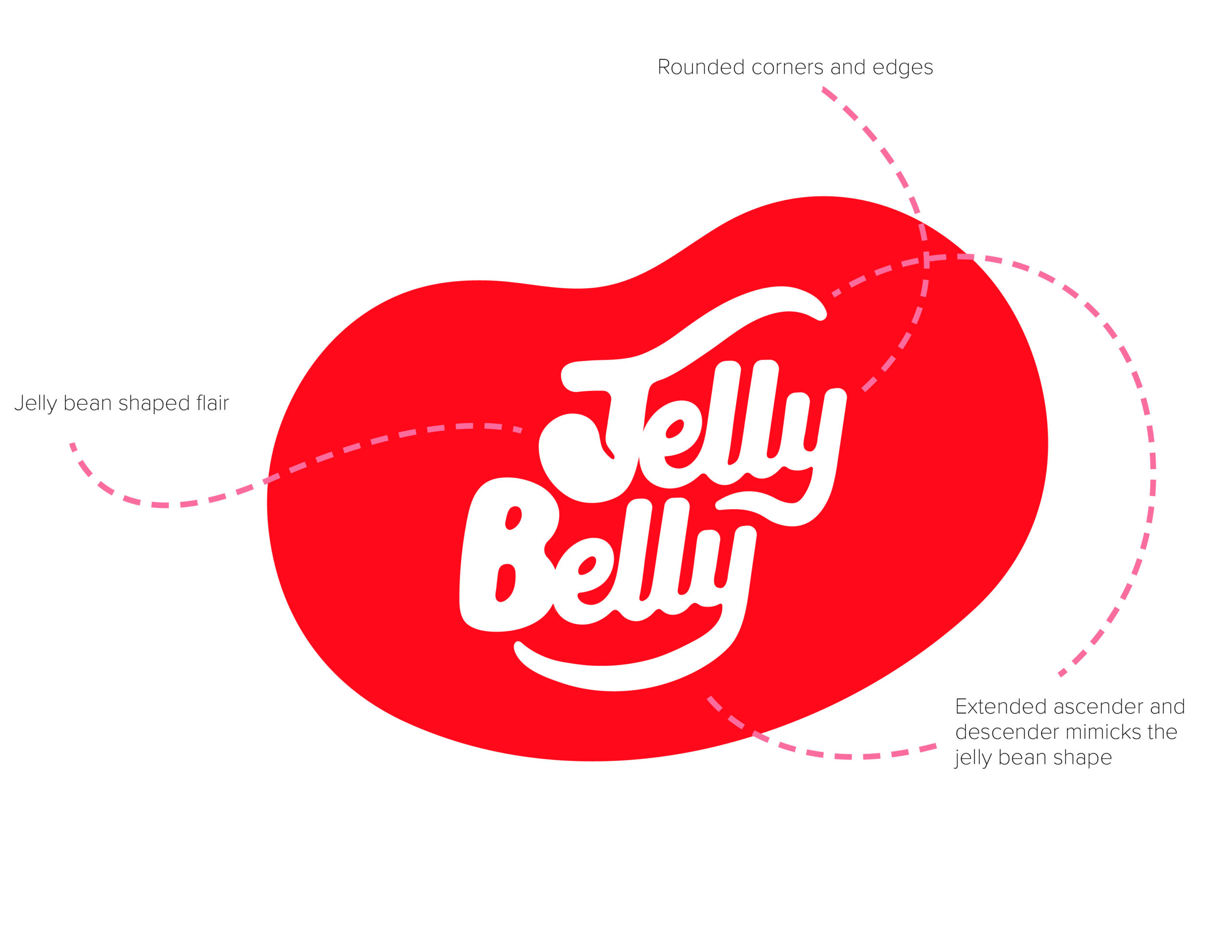
Because Jelly Belly Candy Company is such a beloved staple in American culture I knew I had to modernize the brand in a way that did not disrupt the existing brand equity that Jelly Belly has built with consumers through the years. Looking at the existing logo I considered what was working and what was not.
Working
Bubbly Type
Flowing Script
Jelly Belly Red
Iconic Jelly Bean Shape
Not Working
Sharp Corners
Intense Yellow
Drop Shadow
Included Tagline
Working
Bubbly Type
Flowing Script
Jelly Belly Red
Iconic Jelly Bean Shape
Not Working
Sharp Corners
Intense Yellow
Drop Shadow
Included Tagline
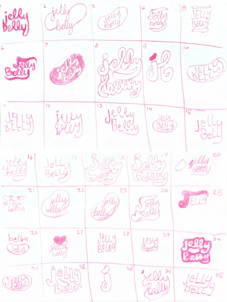
Logo Sketches & Final execution
Dynamic Logo
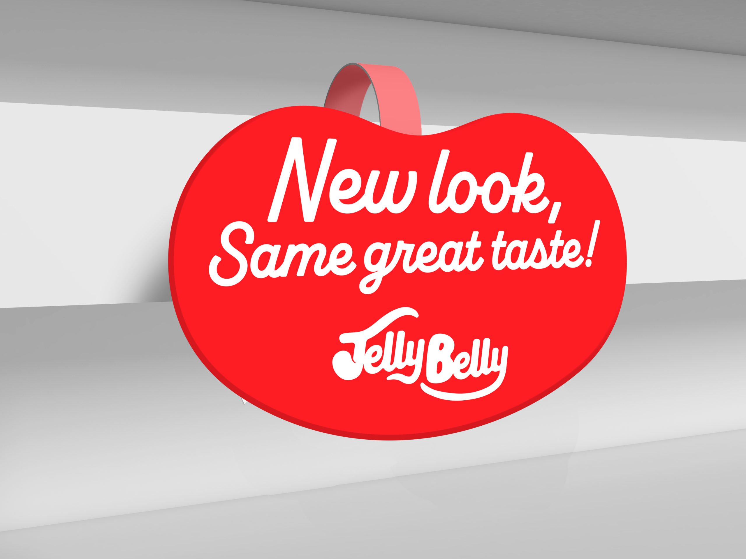
The iconic jelly bean shape is an instantly recognizable shape. With this new, modernized logo I wanted to pull a bit of life into the brand where I could and after I created the logo I realized just how perfectly other colors, patterns, and photos could clip into this bean shape to fit the theme of whatever project it is attached to.
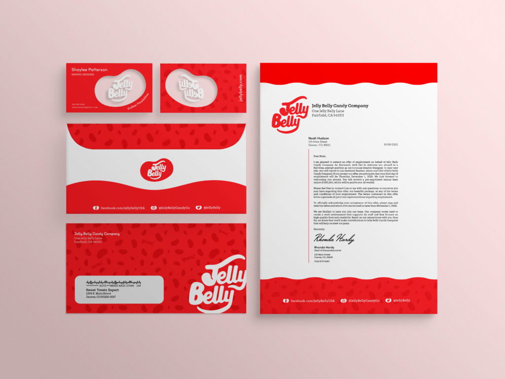
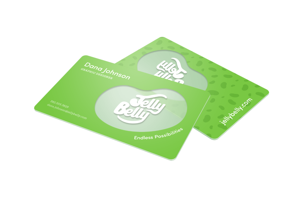
Identity Suite
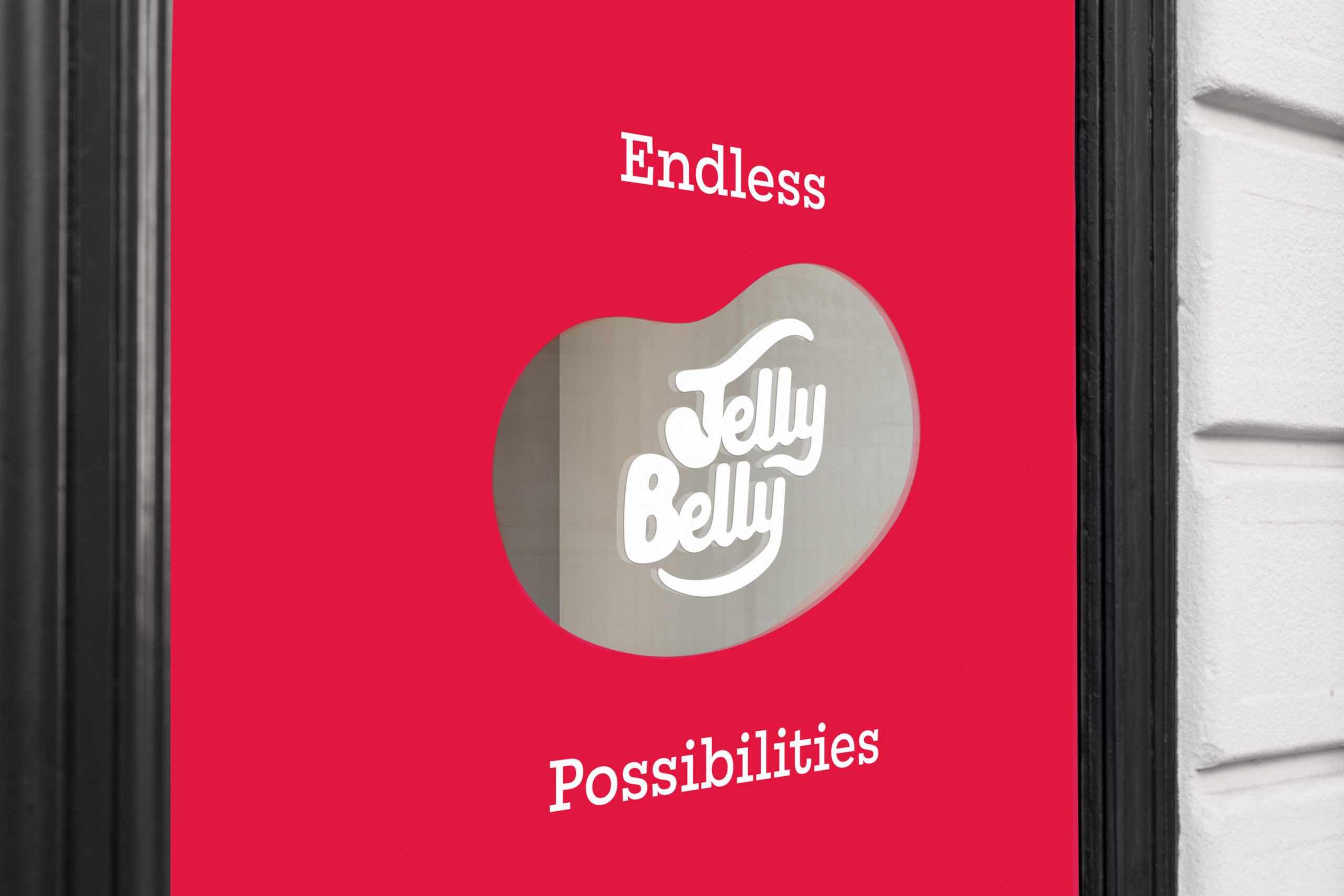
My first utilization of the new dynamic logo was in the brand’s Identity Suite. I wanted the business cards to have a lasting effect on the person resecieving it. The business card features a semi-transparent Jelly Belly logo with the words “Endless Possibilities” anchored to the curve.
Because jelly beans come in almost every color imaginable, I wanted to showcase color within the branding suite as well. Each part of the suite can be customized to the employee’s deparment with other brand colors such as blue, orange, yellow, and so on.
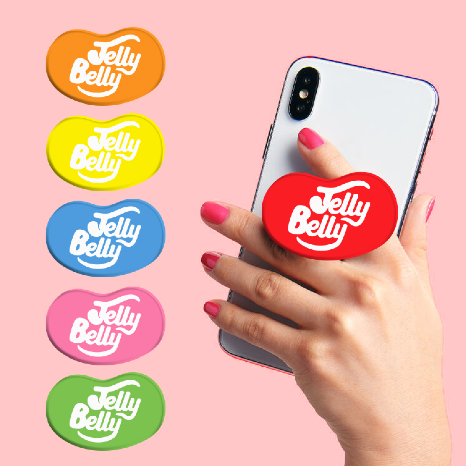
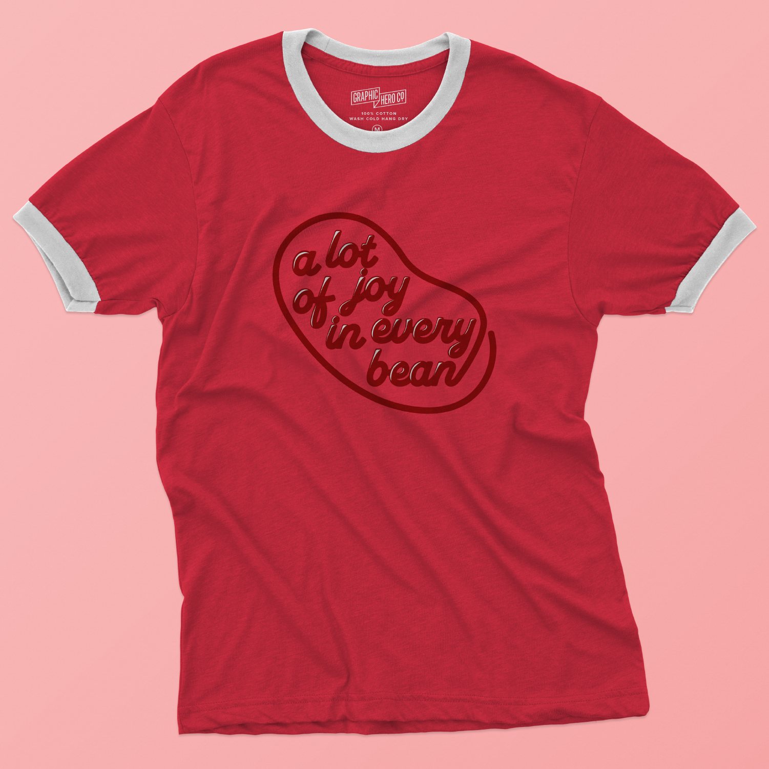
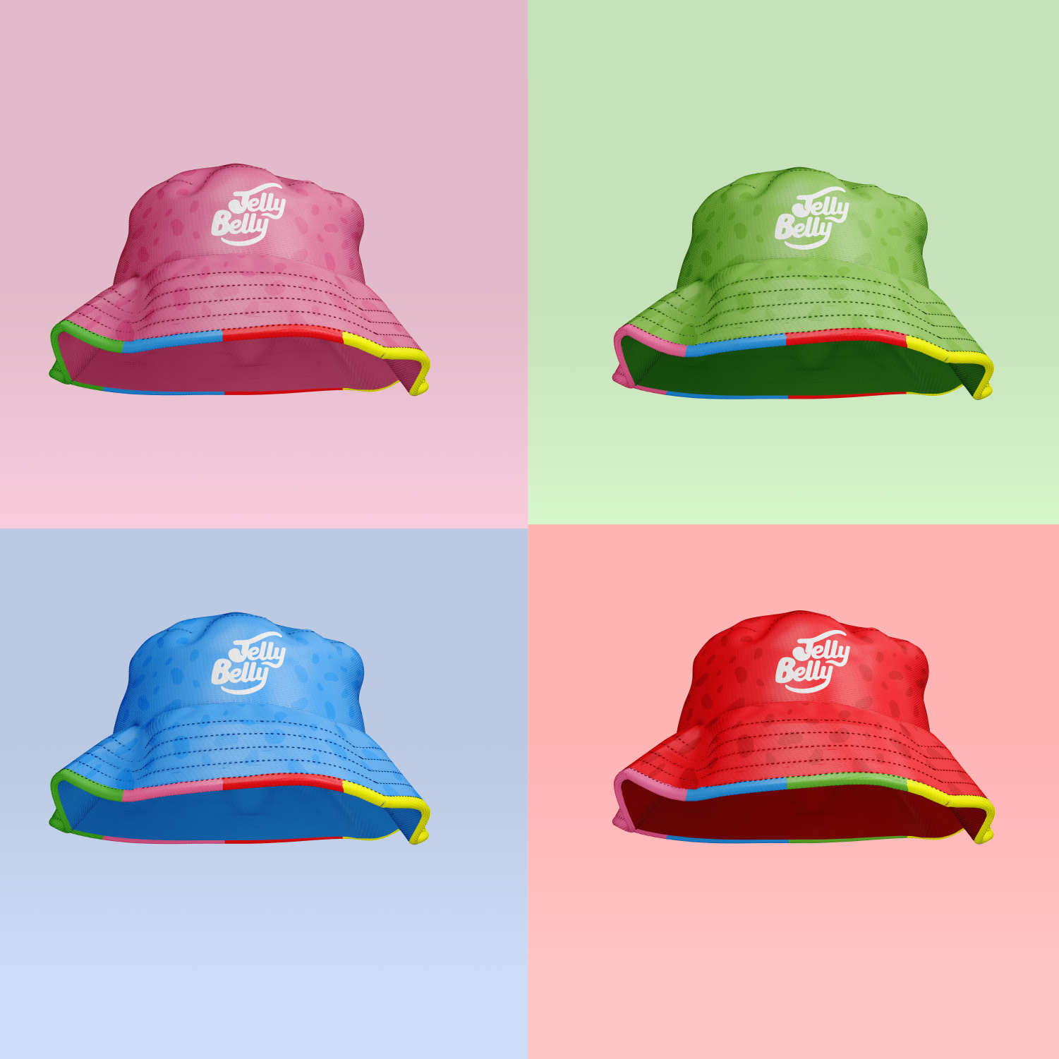
Retail Design
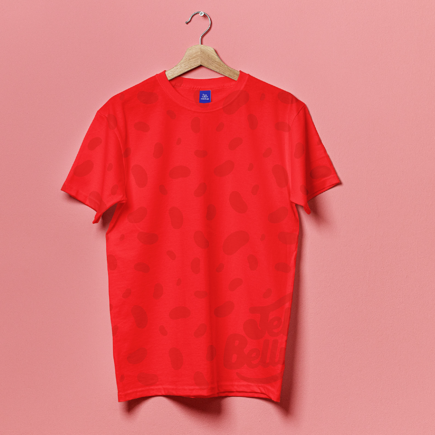
Since part of my mission was to reignite this brand with a more modern audience, I knew that I needed merchandise that would catch the eye of a younger demographic. I used color in bold ways so that it was easy for consumers to pick their favorite. I carefully considered what products would make the most sense with the Jelly Belly logo.
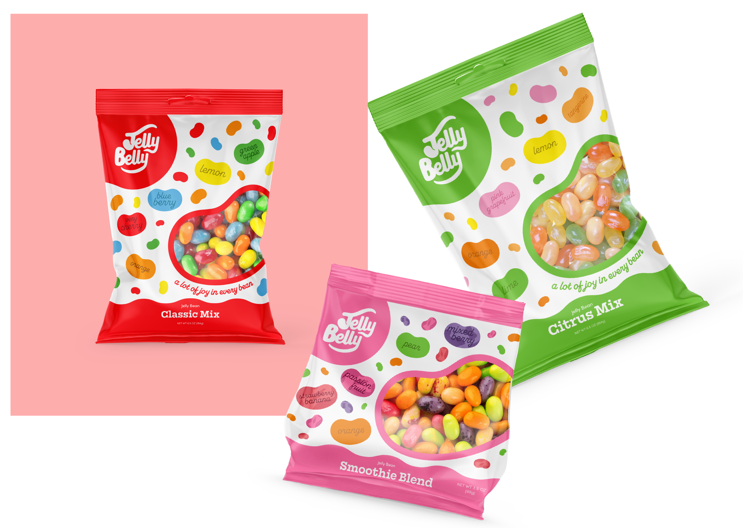
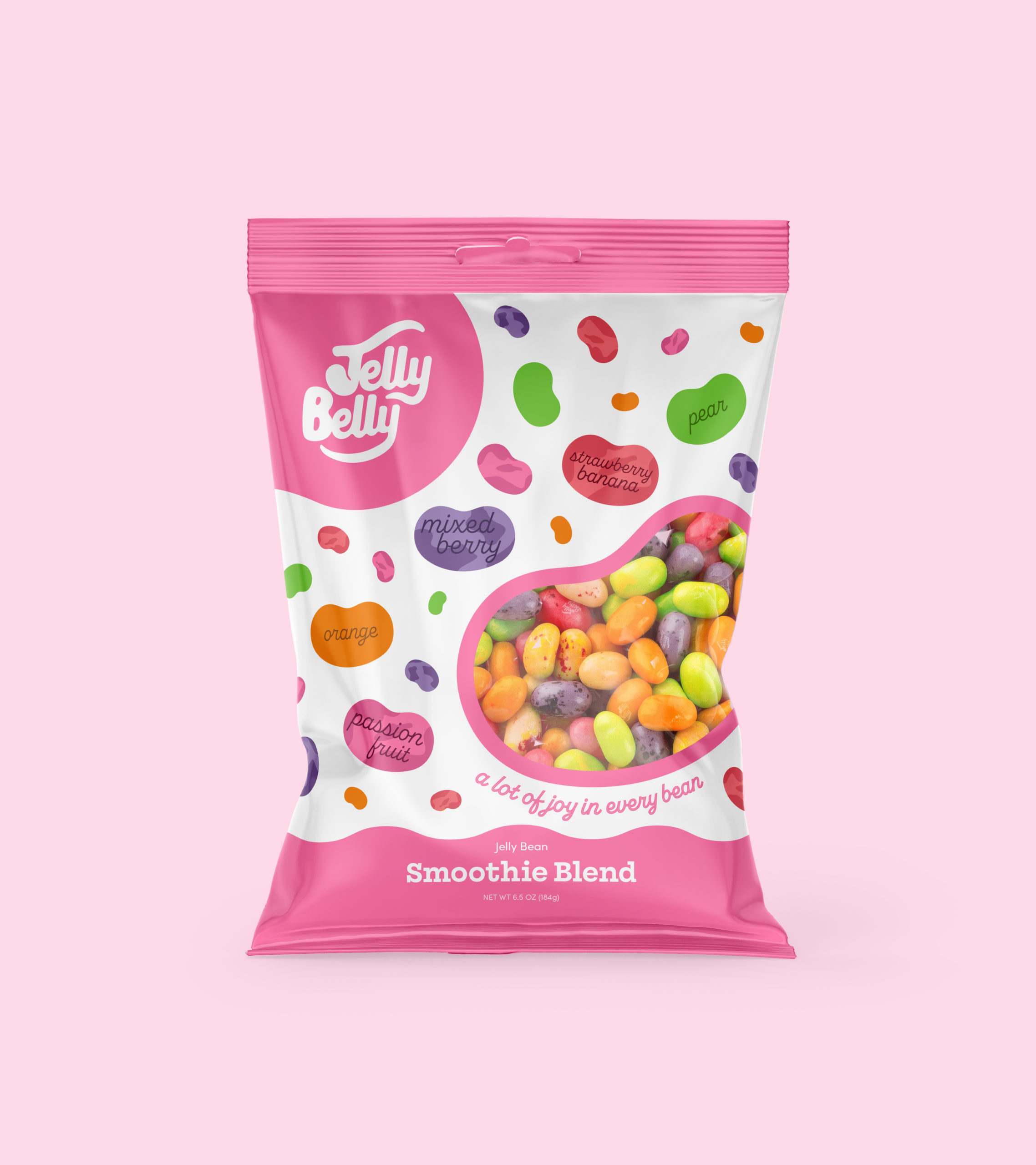
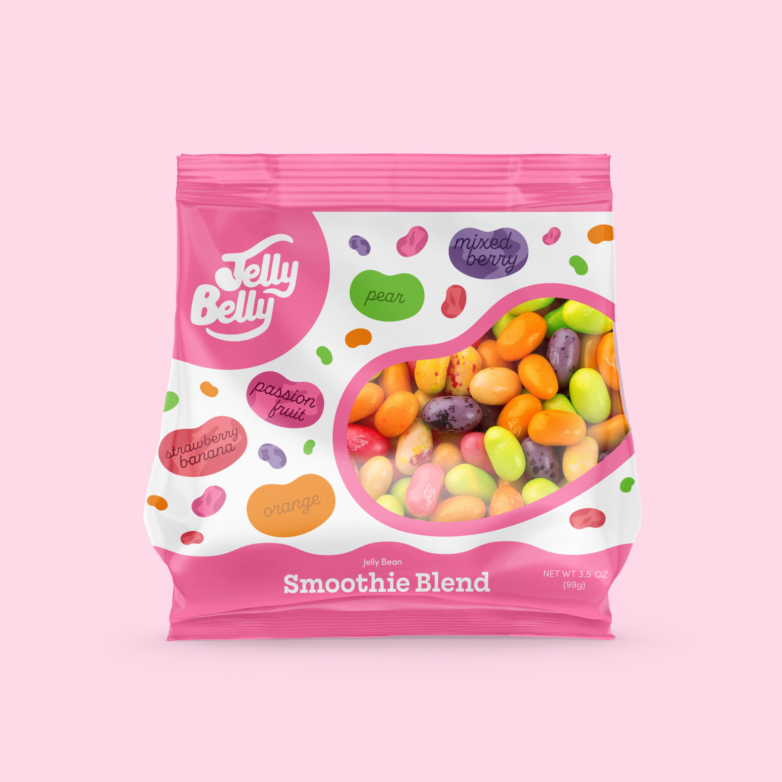
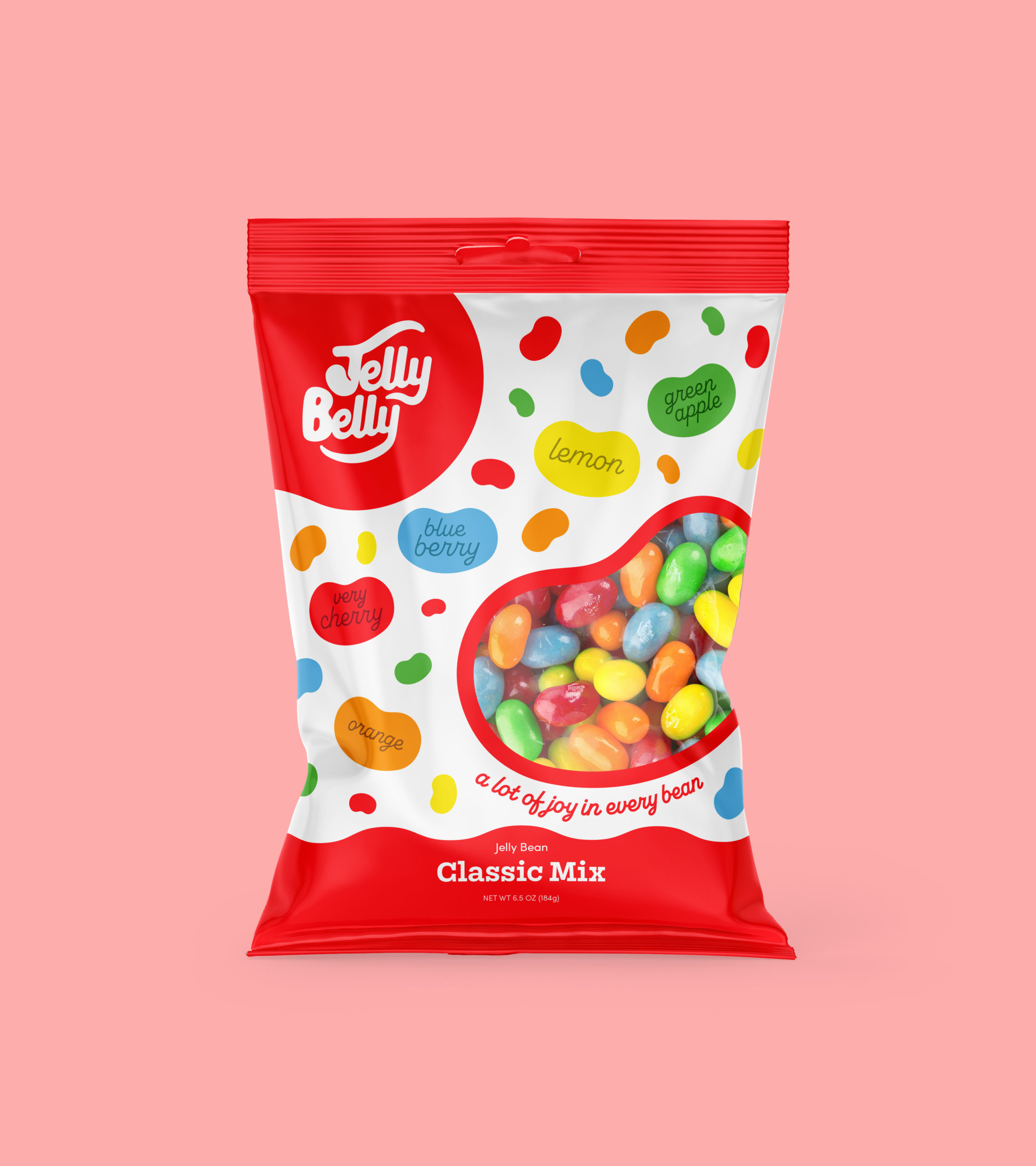
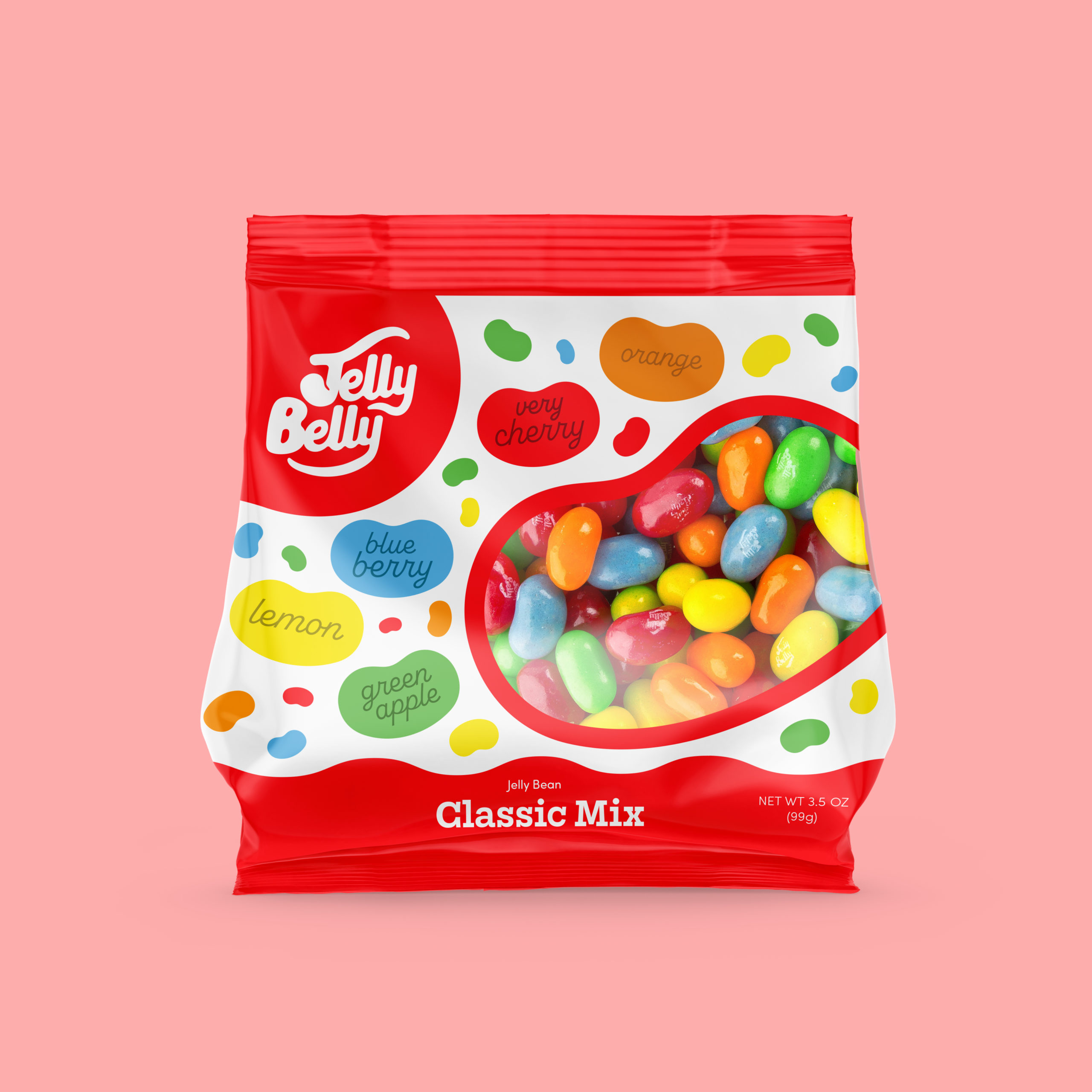
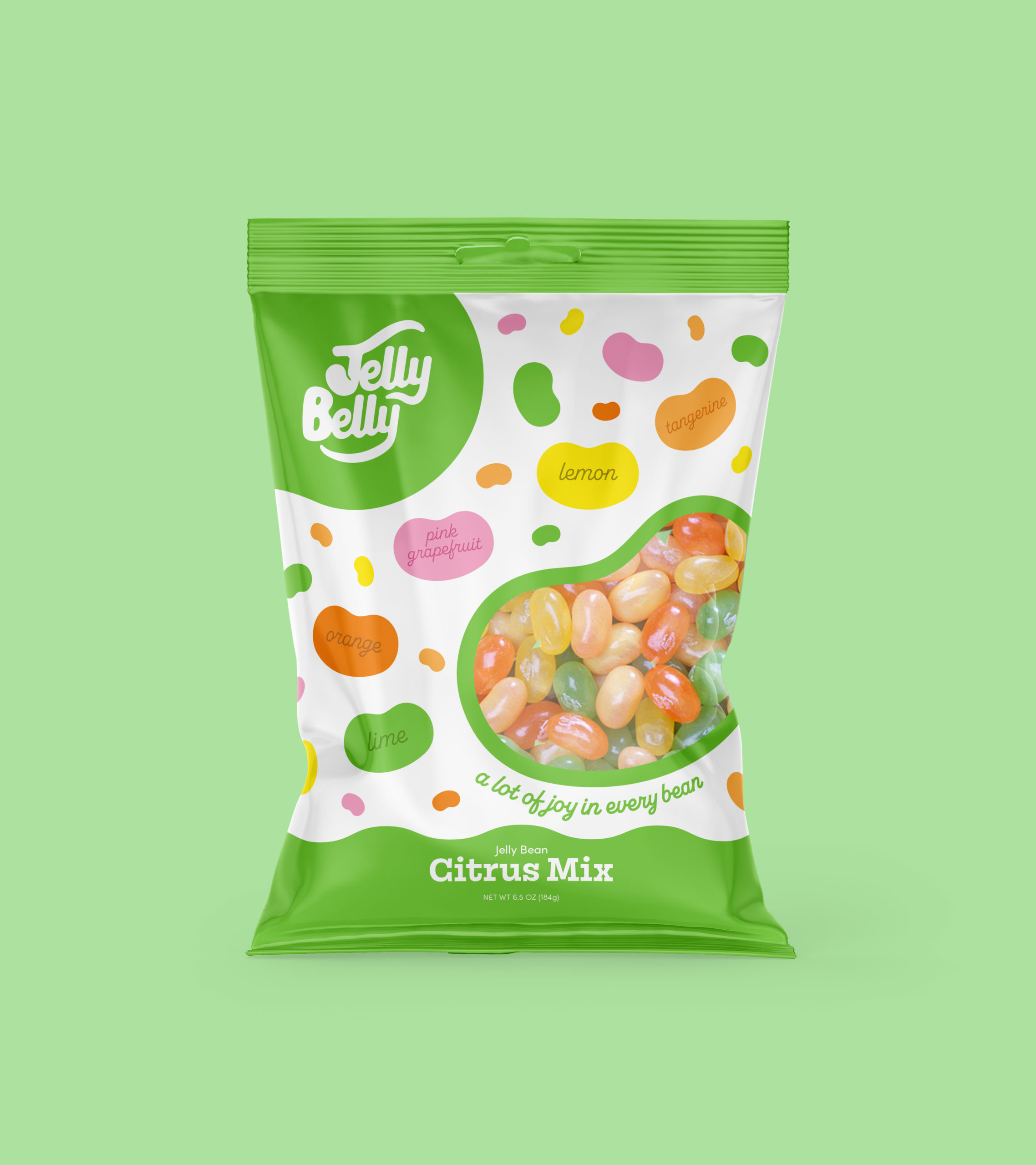
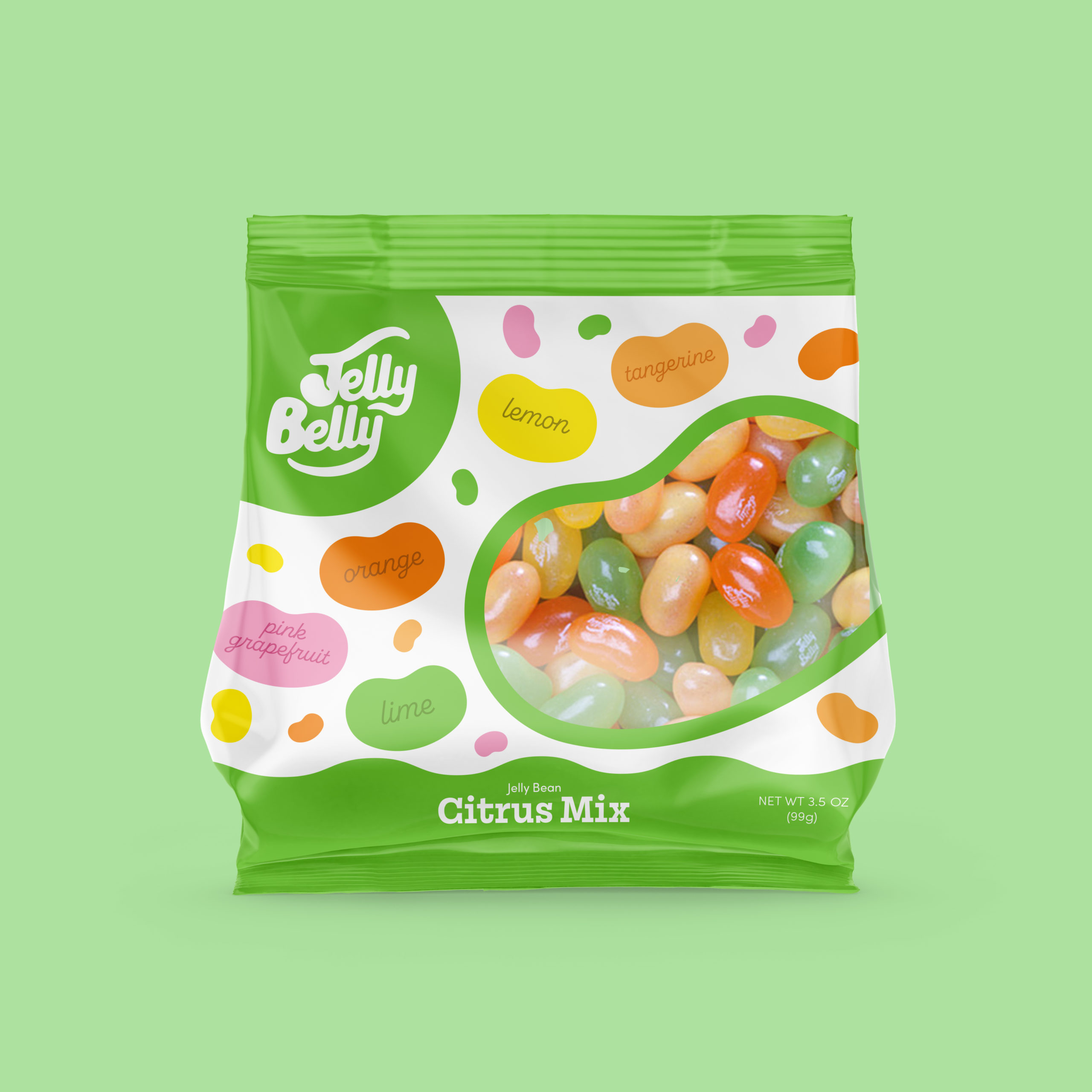
Packaging Design
Jelly Belly’s exsisting brand was lacking that fun, playful spirit that we expect from it. That’s exactly why so many people thought that the company was at least a 100 year old original candy factory. The fun had to hit the source. Engaging and dynamic patterning brings a level of excitement to the bags while the bubbly script brings in a bubbly, friendly feel.
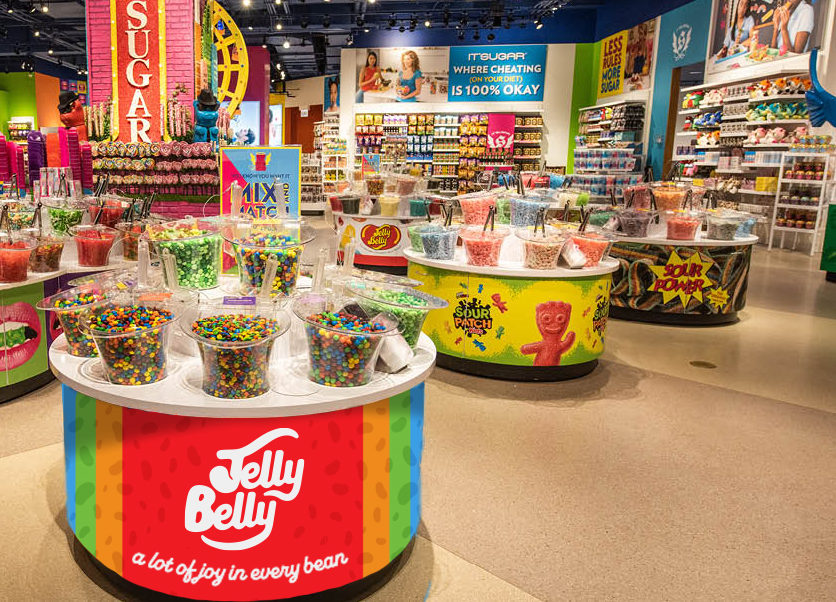
Environmental & Store Design
Annual Report
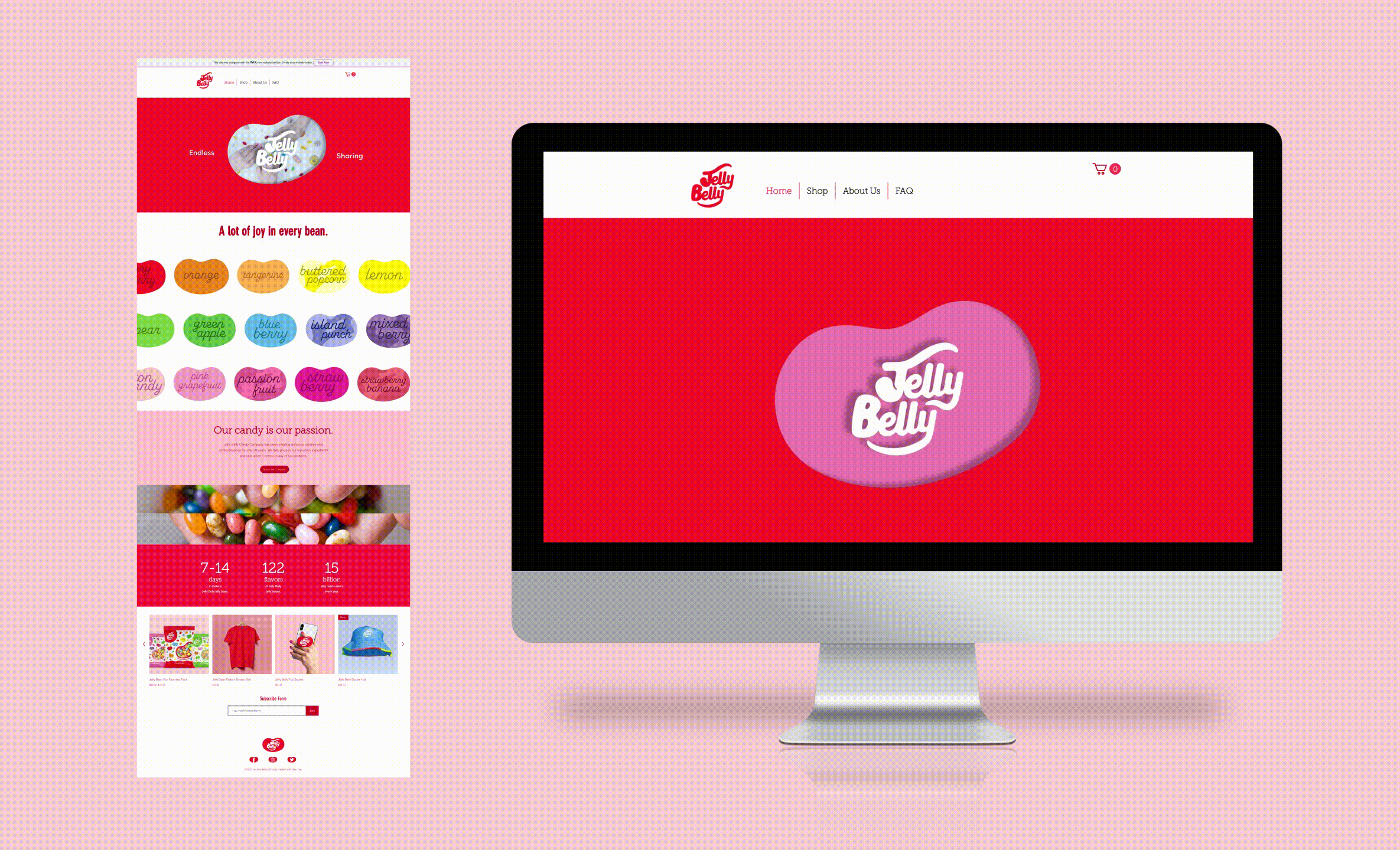
Website Homepage & Animated Hero Image
This rebrand was created for a class project, with no affiliation to Jelly Belly Candy Company. All images, logos, products, videos, and other copyrights or trademarks featured, mentioned, or referred to within the project are the property of Jelly Belly Candy Company. The use of the trade name, copyright, or trademark in my student portfolio for identification and reference purposes only and does not imply any association with the copyright or trademark holder of their product or brand. My work is not affiliated, associated, authorized, maintained, sponsored, endorsed by, or in any way officially connected with these copyright or trademark holders. Jelly Belly Candy Company does not sponsor or endorse any of the shown work. I declare no affiliation, sponsorship, nor any partnerships with any copyright or trademark holders.
All photography used courtesy of Jelly Belly Candy Company and Unsplash.