Joyryde - Mobile App
UI/UX | Branding | Research | Case Study




Project Overview
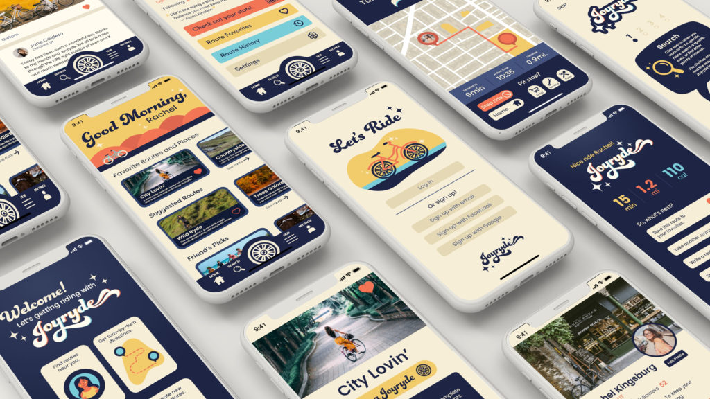
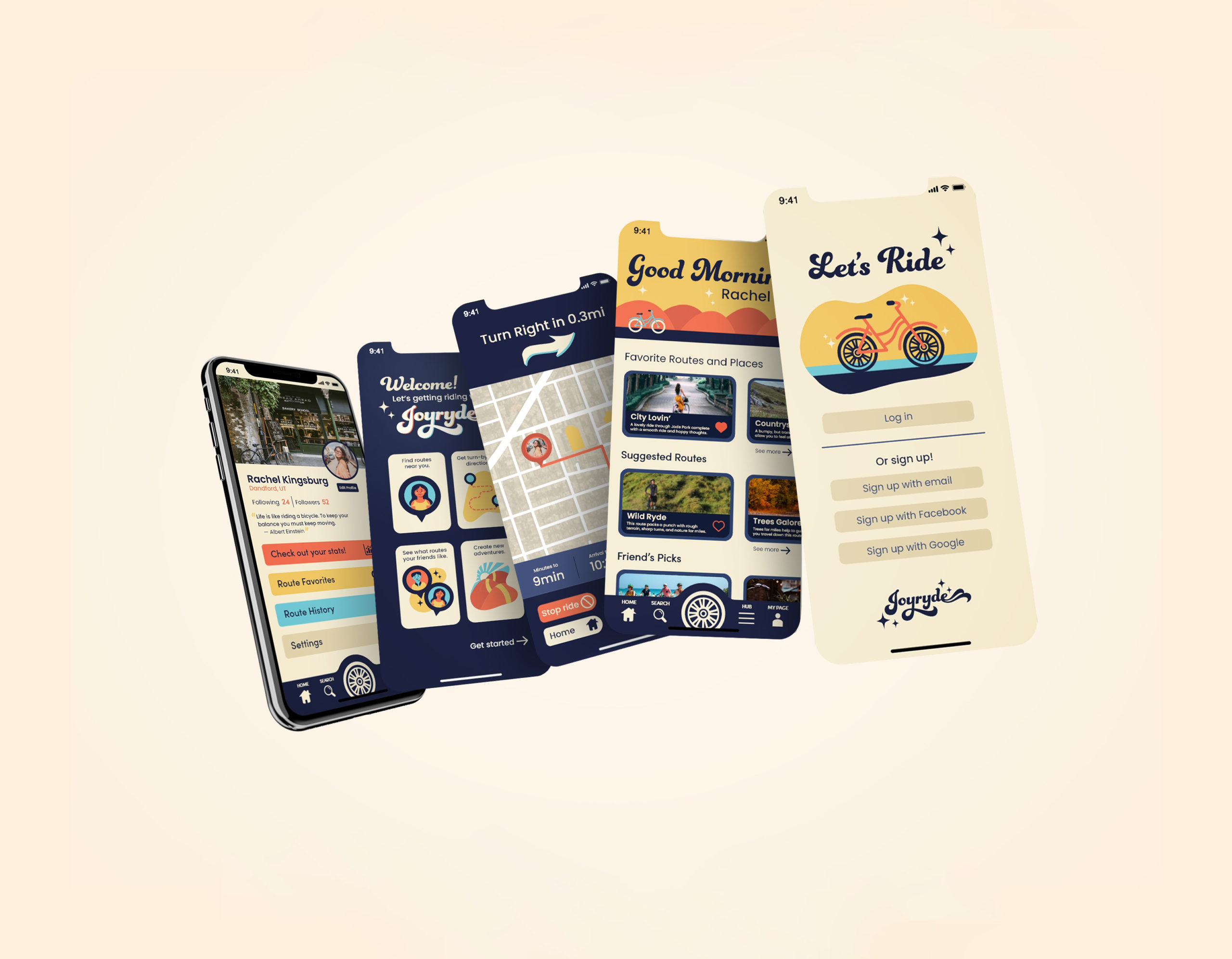
Joyryde is a casual biker’s dream come true. Whether you need to just get around your city or find a new favorite route through nature’s greatest treasures, Joyryde has you covered. Joyryde was created with the idea that we wanted to stray away from the typical fitness-focused biking apps that take over the market. Joyryde provides riders with an easy transition into the world of biking by providing route suggestions, turn-by-turn navigation, and a community feed to share your experiences with. Come on and take a ryde, with Joyryde!
Solution
With this project I set out to fill a gap in the current market for biking apps. I approached the project with a younger, non-fitness-focused audience in mind. The colors and visuals throughout the app are comforting, friendly, and engaging. The brand voice throughout the app is encouraging and positive, no matter what kind of rider the user may be.
Programs Utilized
Adobe XD, Adobe Illustrator
User Interface Research
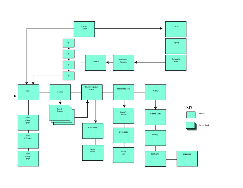
To start this project, I began researching the existing apps in the market to identify their limitations and determine how to overcome them. This involved analyzing the needs of both users and clients, primary and secondary audiences, necessary user flows, and other relevant factors. By conducting this thorough research, I gained valuable insights into what I wanted the app to offer and started drafting a site map to guide the creation of corresponding screens.
Having a solid foundation from the start saved me significant time and effort. I could easily refer to my planning document to ensure that my designs stayed within the intended parameters and aligned with my research. Ultimately, this approach allowed me to create an app that met the needs of users and clients alike while delivering a smooth and intuitive experience for everyone who uses it.
User Interface Research

To start this project, I began researching the existing apps in the market to identify their limitations and determine how to overcome them. This involved analyzing the needs of both users and clients, primary and secondary audiences, necessary user flows, and other relevant factors. By conducting this thorough research, I gained valuable insights into what I wanted the app to offer and started drafting a site map to guide the creation of corresponding screens.
Having a solid foundation from the start saved me significant time and effort. I could easily refer to my planning document to ensure that my designs stayed within the intended parameters and aligned with my research. Ultimately, this approach allowed me to create an app that met the needs of users and clients alike while delivering a smooth and intuitive experience for everyone who uses it.
Hi-Fi Wireframes
User Interface Design
Tutorial Screen
Because this app utilizes unconventional UI elements that go beyond standard design practices, I felt it was essential to introduce these features to users through a tutorial. I wanted to make sure that users were excited and engaged right from the start, so I incorporated playful colors and friendly illustrations in the initial screen. This approach ensures that users can get up to speed with the app’s unique features without any frustration or confusion.
Home Screen
When you open the app, the home screen welcomes you with personalized messages that change throughout the day, adding a friendly and comforting touch to your experience. Additionally, this screen features several predefined routes, each with a title and brief description to give users an idea of what to expect on each route. The app automatically categorizes routes based on various tracking scenarios, making it easy for users to start a Joyryde.
Route Screen
This screen provides users with all the details they need to plan their biking adventure. This includes essential information such as route distance, estimated completion time, user ratings, and photos of the route. When you’re ready to start your ride, simply click the “Take a Joyryde” button, and the app will take you to the active map screen. With all the information you need at your fingertips, the route screen makes planning your next biking adventure a breeze.
Active Navigation
The navigation section is the core feature of the Joyryde app, providing users with navigation technology specifically tailored for biking. The screen displays important information about your route, including time of arrival, minutes to your destination, and distance to your destination. You’ll also have access to a range of pit stop options, for various trip needs. With all these features at your fingertips, you can confidently enjoy your ride!
Prototyping & Final Execution
Designing the screens was just the beginning of this mobile project. After researching the market and user needs, I realized that existing apps were either too complex or unengaging. To ensure the Joyryde app was both easy to navigate and enjoyable to use, I created a working prototype and conducted user testing. The process involved numerous connections and considerations, which are illustrated in the image below. This iterative approach helped me refine the app’s functionality and user experience, ensuring it meets the needs of its intended audience.
