Lolly's Learn & Grow Center Website Rebrand
UI/UX | Branding


Project Overview
Lolly’s Learn & Grow Center is a very loved daycare with a passion for teaching your kiddos as much as possible. They strive to emphasize how important creating a safe learning environment is to help your children learn and grow! With their ever-growing business, Lolly’s was in need of a branding and website redesign.
Solution
With this redesign, I wanted to provide their current and incoming families with information and visuals to help keep their minds at ease. By providing plenty of photos of their current kiddos and teachers while pairing this with a soft but fun color palette, parents will feel more comfortable reaching out and learning more! The movement throughout the protoyped site is gentle and fun to help drive home that messaging in hopes that parents take this away when clicking off.
Programs Utilized
Adobe XD, Adobe Illustrator
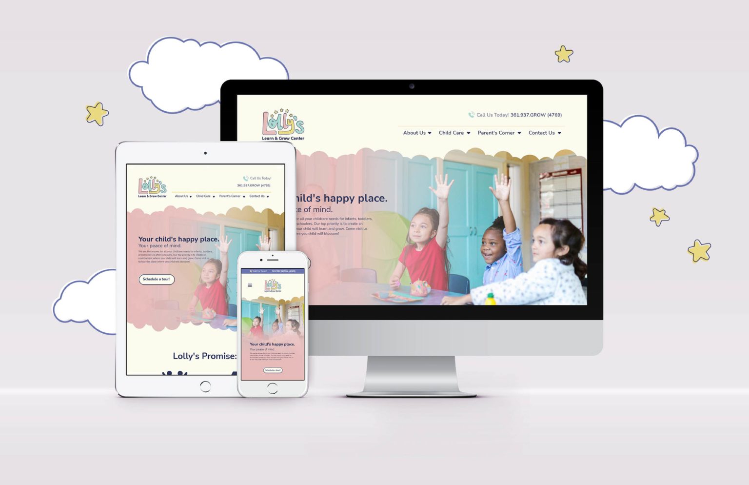
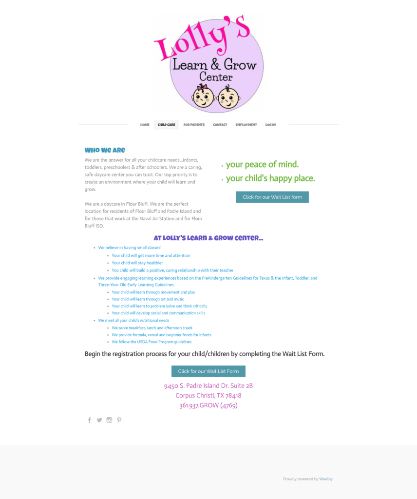
Existing Branding & Current Website
Redesigned Logo and Branding Sample

Hi-Fi Wireframes
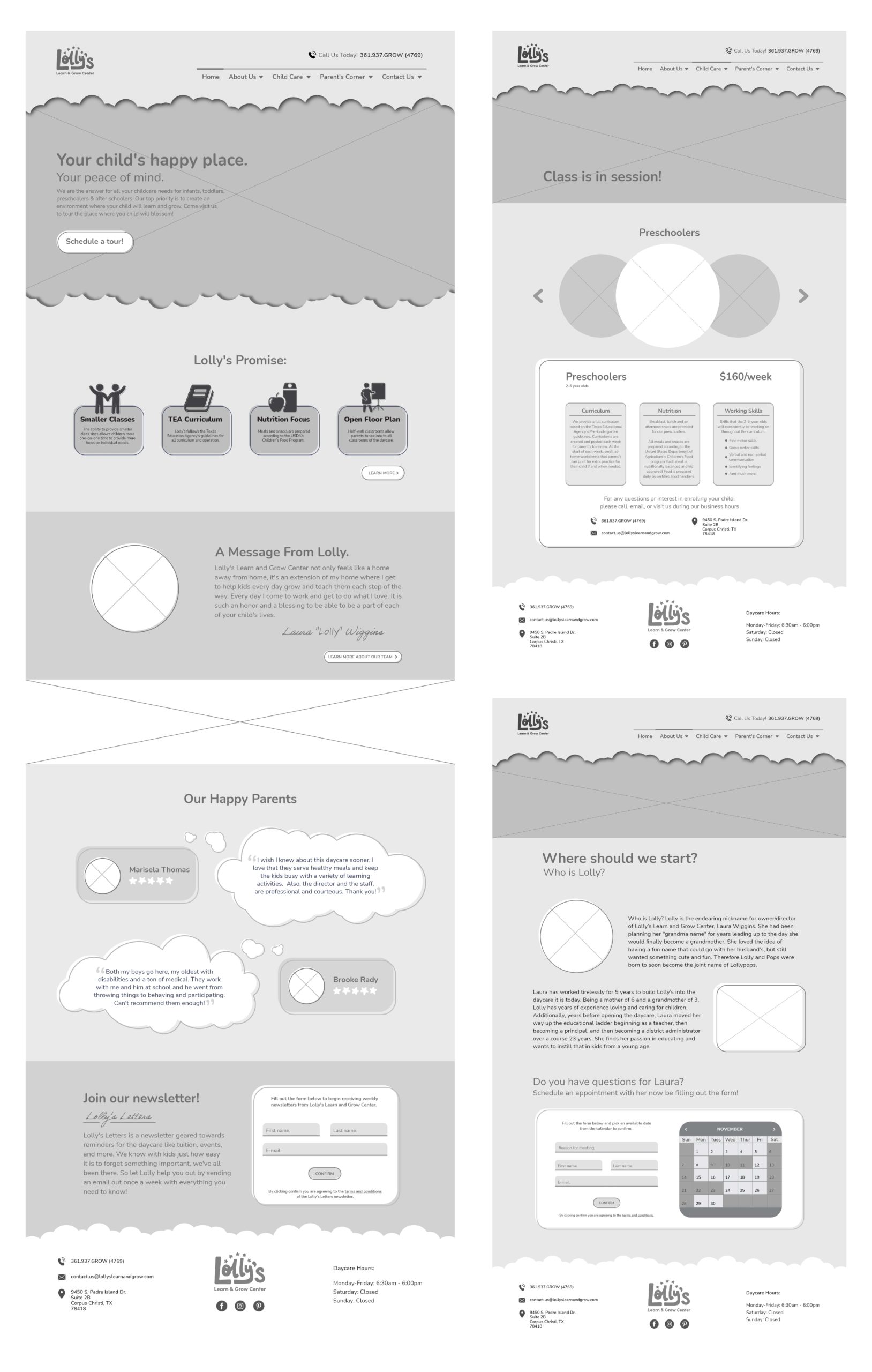
Screen Designs
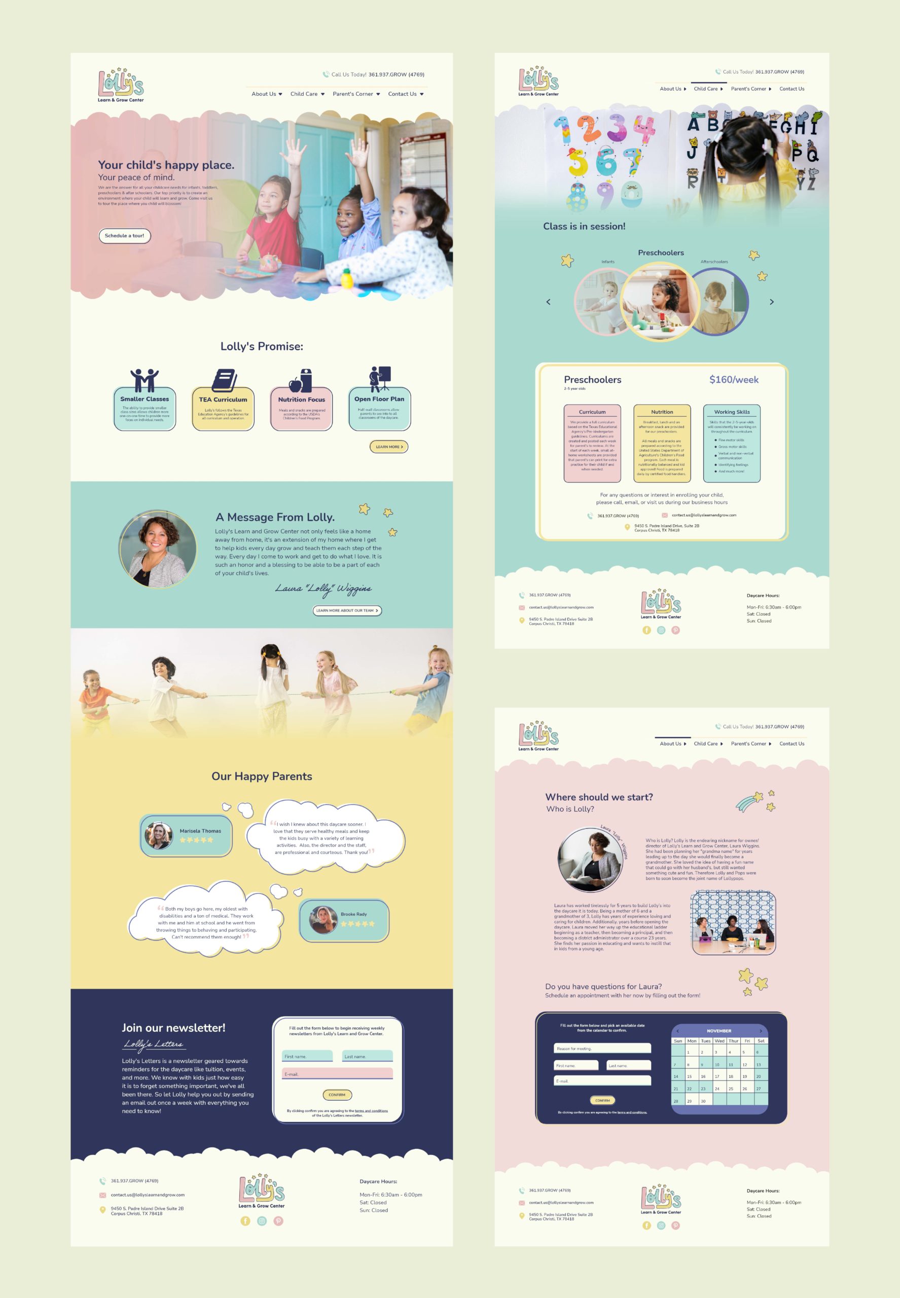
Interactive Prototype
All images, logos, products, videos, and other copyrights or trademarks featured, mentioned, or referred to within the project are the property of Lolly’s Learn & Grow Center. The use of the trade name, copyright, or trademark in my student portfolio for identification and reference purposes only and does not imply any association with the copyright or trademark holder of their product or brand. My work is not affiliated, associated, authorized, maintained, sponsored, endorsed by, or in any way officially connected with these copyright or trademark holders. Lolly’s Learn & Grow Center does not sponsor or endorse any of the shown work. I declare no affiliation, sponsorship, nor any partnerships with any copyright or trademark holders.
